As often as we hear these days how the Earth’s climate is warming due to all the carbon dioxide we’re pouring into the air by burning fossil fuels, I thought it’d be worth mentioning that until a few weeks ago the concentration of CO2 in the atmosphere had been falling rapidly for months. In fact, it started to fall in late May, and continued to do so all through summer and into autumn, finally slowing down in October. By now, the amount of CO2 in the air is increasing again.
But actually, it does this every year. What’s going on?
Inhale. Exhale. Inhale. Exhale. Each year, from mid-spring through early autumn, the concentration of CO2 in the atmosphere falls as plants throughout the northern hemisphere put on new growth, drawing vast quantities of carbon dioxide out of the air to make leaves, roots, bark, flowers, fruit, and seeds.
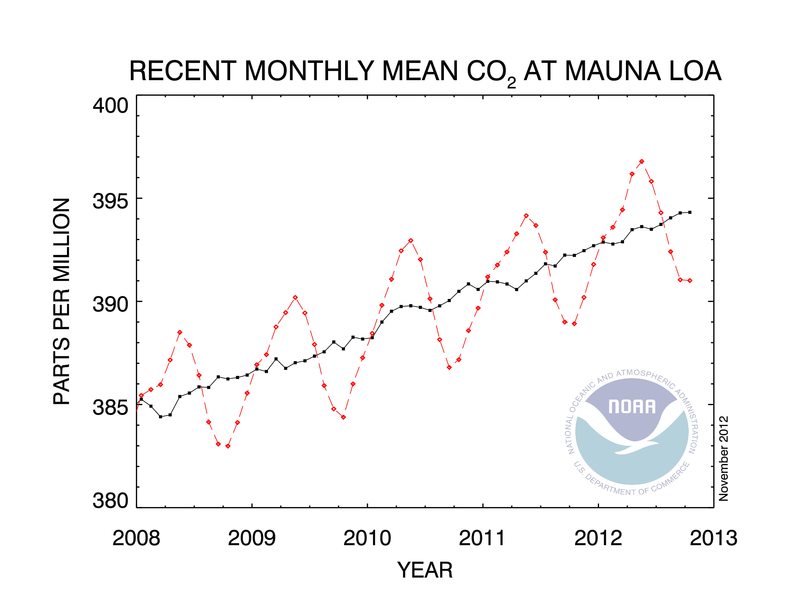
Then, in September and October, the decline slows and reverses as autumn sets in. Leaves fall and begin to decay, annuals begin to die, and much of the carbon they contain recombines with oxygen from the air and is released back to the atmosphere. The carbon dioxide level begins to rise, and it doesn’t turn down again until the following May, when the new spring’s growth begins. This annual cycle is clearly seen in data from CO2 monitoring stations, like the famous one at Mauna Loa in Hawaii from which this graph is taken.
 Up and down. Up and down. The connected red dots show the average CO2 concentration in each month from January 2008 through last month, October 2012. The highest point in each year is in May, and the lowest is in September or October. It falls very rapidly during late spring, summer, and early autumn, with temperate region plants all over the world inhaling like crazy, and then increases, more slowly, from mid-autumn, through winter, into mid-spring as they exhale.
But what about the southern hemisphere? It has seasons, doesn’t it? Why does the pattern follow only the northern hemisphere’s seasons? It does this because nearly 70% of the Earth’s land surface is located up here. The tropics, straddling the equator as they do, are not much affected one way or the other by the seasons, and there is so little land in the southern hemisphere south of the tropics that there just aren’t that many plants down there compared with up north.
The other part of this chart are the connected black dots. What are they about? Well, suppose we had no seasons, that the sun was always directly above the equator. Then there would be no annual cycle of plant growth, and almost all the change from month to month in how much carbon dioxide the atmosphere is holding would be what our burning of fossil fuels dumps into it that doesn’t get absorbed by the oceans (and then there’s the occasional blip from a volcano erupting, or something).
But that’s not the world we live in. The Earth is tilted. We have seasons. So when the red dots on the graph—the actual measured concentration—are all we have to go on, how do we tell how much is us and how much is the planet breathing?
Well, suppose you calculate the average concentration of CO2 in each year, and then you notice that from January to July, the measured concentration is always above average, and from August through December it’s always below average. And then you notice that January is always only a little above average, but May tends to be quite a lot above average. And so on. You begin to get a sense of how much of the variation in each month is due just to the time of year it’s in. Once you calculate that, the seasonal part, you can subtract it out and what’s left are the black dots. This is the part that’s changing mostly due to us. It may be a bit jerky, but it’s definitely going up.
Now, the actual method used to estimate the trend is more involved than that, but you get the idea. There’s one more thing. If you look closely at that chart, you can see that the annual cycle, up and down around the trend, changes the concentration of CO2 by, oh, about seven parts per million. That is, if there were no upward trend, the concentration of carbon dioxide in the atmosphere would vary up and down by about that much over the course of a year.
But seven parts per million is about how much the black trend line itself goes up every four years or so. So about every four years we add as much new CO2 to our atmosphere as is taken out of it every spring and summer (and put back into it every fall and winter) in the annual cycle of growth and decay of all the temperate region plants in the world.
Now that’s a sobering thought. One thing it means is we’re not getting out of this by planting trees. We absolutely must stop putting fossil carbon into the atmosphere. There simply is no other way.
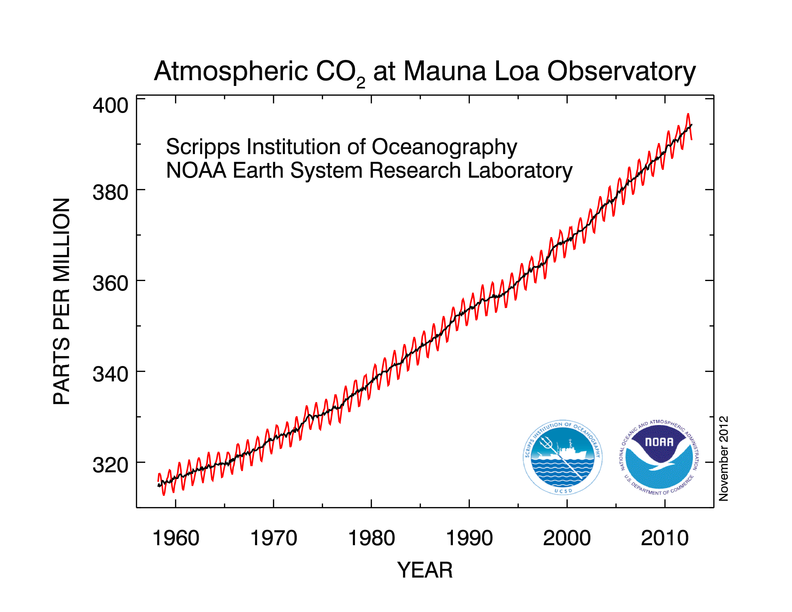
The complete CO2 data record from Mauna Loa, beginning with the first observations made in 1958, looks like this:
Graphs of Mauna Loa Observatory CO2 data were obtained from Trends in Atmospheric Carbon Dioxide (NOAA Earth System Research Laboratory), on November 29, 2012 at 11:12 pm.

